adminlte主题中文文档
文件结构
1
2
3
4
5
6
7
8
9
10
11
12
13
14
15
16
File Hierarchy of the Source Code Package AdminLTE/ ├── dist/ │ ├── CSS/ │ ├── JS │ ├── img ├── build/ │ ├── less/ │ │ ├── AdminLTE's Less files │ └── Bootstrap-less/ (Only for reference. No modifications have been made) │ ├── mixins/ │ ├── variables.less │ ├── mixins.less └── plugins/ ├── All the customized plugins CSS and JS files
布局
.wrapper.一个div包裹着整个网站。.main-header. 包含导航和logo。.sidebar-wrapper. 包含用户面板和侧边栏。.content-wrapper. 包含页面的头部和内容。
布局options
AdminLTE 2.0提供了一组应用于主布局的选项。可以将这些类中的每一个添加到body标记中以获得所需的目标。
修复: 使用该类.fixed获取固定标题和侧边栏。折叠边栏: 使用该类.sidebar-collapse在加载时折叠侧边栏。盒装布局: 使用该类.layout-boxed获得仅延伸至1250像素的盒装布局。顶部导航 使用该类.layout-top-nav删除侧边栏并在顶部导航栏中显示您的链接。
皮肤 皮肤可以在dist / css / skins文件夹中找到。选择所需的外观文件,然后将相应的类添加到body标签以更改模板的外观。以下是可用皮肤的列表:
皮肤
skin-blue
skin-blue-light
skin-yellow
skin-yellow-light
skin-green
skin-green-light
skin-purple
skin-purple-light
skin-red
skin-red-light
skin-black
skin-black-light
adminlte JavaScirpt选项 可以使用以下方法之一修改AdminLTE app.js的选项。
编辑app.js 在主Javascript文件中,修改$.AdminLTE.options对象以适合您的用例。
定义AdminlteOptions 在初始化app.js之前初始化,例如
1
2
3
4
5
6
7
8
9
10
11
12
13
<script> var AdminLTEOptions = { sidebarExpandOnHover: true , enableBoxRefresh: true , enableBSToppltip: true }; </script> <script src="dist/ js/app.js" type=" text/javascript"></script>
1
2
3
4
5
6
7
8
9
10
11
12
13
14
15
16
17
18
19
20
21
22
23
24
25
26
27
28
29
30
31
32
33
34
35
36
37
38
39
40
41
42
43
44
45
46
47
48
49
50
51
52
53
54
55
56
57
58
59
60
61
62
63
64
65
66
67
68
69
70
71
72
73
74
75
76
77
78
79
80
81
82
83
84
85
86
87
88
89
90
91
92
93
94
95
96
97
98
99
{ navbarMenuSlimscroll: true , navbarMenuSlimscrollWidth: "3px" , navbarMenuHeight: "200px" , animationSpeed: 500 , sidebarToggleSelector: "[data-toggle='offcanvas']" , sidebarPushMenu: true , sidebarSlimScroll: true , sidebarExpandOnHover: false , enableBoxRefresh: true , enableBSToppltip: true , BSTooltipSelector: "[data-toggle='tooltip']" , enableFastclick: true , enableControlTreeView: true , enableControlSidebar: true , controlSidebarOptions: { toggleBtnSelector: "[data-toggle='control-sidebar']" , selector: ".control-sidebar" , slide: true }, enableBoxWidget: true , boxWidgetOptions: { boxWidgetIcons: { collapse: 'fa-minus' , open: 'fa-plus' , remove: 'fa-times' }, boxWidgetSelectors: { remove: '[data-widget="remove"]' , collapse: '[data-widget="collapse"]' } }, directChat: { enable: true , contactToggleSelector: '[data-widget="chat-pane-toggle"]' }, colors: { lightBlue: "#3c8dbc" , red: "#f56954" , green: "#00a65a" , aqua: "#00c0ef" , yellow: "#f39c12" , blue: "#0073b7" , navy: "#001F3F" , teal: "#39CCCC" , olive: "#3D9970" , lime: "#01FF70" , orange: "#FF851B" , fuchsia: "#F012BE" , purple: "#8E24AA" , maroon: "#D81B60" , black: "#222222" , gray: "#d2d6de" }, screenSizes: { xs: 480 , sm: 768 , md: 992 , lg: 1200 } }
主标题 主标题包含徽标和导航栏。导航栏的构造与Bootstrap略有不同,因为它具有Bootstrap不提供的组件。导航栏可以通过两种方式构建。这是普通导航栏的示例,接下来我们将提供顶部导航布局的示例。
侧边航栏 1 2 3 4 5 6 7 8 9 10 11 12 13 14 15 16 17 18 19 20 21 22 23 24 25 26 27 28 29 30 31 32 33 34 35 36 37 38 39 40 41 42 43 44 45 46 47 48 49 50 51 52 53 54 55 56 57 58 59 60 61 62 63 64 65 66 67 68 69 70 71 72 73 74 75 76 77 78 79 80 81 82 83 84 85 86 87 88 89 90 91 92 93 94 95 96 97 98 99 100 101 102 103 104 105 106 107 108 109 110 111 112 113 114 115 116 117 118 119 120 121 122 123 124 125 126 127 128 129 130 131 132 133 134 135 136 137 138 139 140 <header class ="main-header" > <a href ="../../index2.html" class ="logo" > AdminLTE </a > <nav class ="navbar navbar-static-top" role ="navigation" > <div class ="navbar-custom-menu" > <ul class ="nav navbar-nav" > <li class ="dropdown messages-menu" > <a href ="#" class ="dropdown-toggle" data-toggle ="dropdown" > <i class ="fa fa-envelope-o" > </i > <span class ="label label-success" > 4</span > </a > <ul class ="dropdown-menu" > <li class ="header" > You have 4 messages</li > <li > <ul class ="menu" > <li > <a href ="#" > <div class ="pull-left" > <img src ="dist/img/user2-160x160.jpg" class ="img-circle" alt ="User Image" > </div > <h4 > Sender Name <small > <i class ="fa fa-clock-o" > </i > 5 mins</small > </h4 > <p > Message Excerpt</p > </a > </li > ... </ul > </li > <li class ="footer" > <a href ="#" > See All Messages</a > </li > </ul > </li > <li class ="dropdown notifications-menu" > <a href ="#" class ="dropdown-toggle" data-toggle ="dropdown" > <i class ="fa fa-bell-o" > </i > <span class ="label label-warning" > 10</span > </a > <ul class ="dropdown-menu" > <li class ="header" > You have 10 notifications</li > <li > <ul class ="menu" > <li > <a href ="#" > <i class ="ion ion-ios-people info" > </i > Notification title </a > </li > ... </ul > </li > <li class ="footer" > <a href ="#" > View all</a > </li > </ul > </li > <li class ="dropdown tasks-menu" > <a href ="#" class ="dropdown-toggle" data-toggle ="dropdown" > <i class ="fa fa-flag-o" > </i > <span class ="label label-danger" > 9</span > </a > <ul class ="dropdown-menu" > <li class ="header" > You have 9 tasks</li > <li > <ul class ="menu" > <li > <a href ="#" > <h3 > Design some buttons <small class ="pull-right" > 20%</small > </h3 > <div class ="progress xs" > <div class ="progress-bar progress-bar-aqua" style ="width: 20%" role ="progressbar" aria-valuenow ="20" aria-valuemin ="0" aria- valuemax ="100" > <span class ="sr-only" > 20% Complete</span > </div > </div > </a > </li > ... </ul > </li > <li class ="footer" > <a href ="#" > View all tasks</a > </li > </ul > </li > <li class ="dropdown user user-menu" > <a href ="#" class ="dropdown-toggle" data-toggle ="dropdown" > <img src ="dist/img/user2-160x160.jpg" class ="user-image" alt ="User Image" > <span class ="hidden-xs" > Alexander Pierce</span > </a > <ul class ="dropdown-menu" > <li class ="user-header" > <img src ="dist/img/user2-160x160.jpg" class ="img-circle" alt ="User Image" > <p > Alexander Pierce - Web Developer <small > Member since Nov. 2012</small > </p > </li > <li class ="user-body" > <div class ="col-xs-4 text-center" > <a href ="#" > Followers</a > </div > <div class ="col-xs-4 text-center" > <a href ="#" > Sales</a > </div > <div class ="col-xs-4 text-center" > <a href ="#" > Friends</a > </div > </li > <li class ="user-footer" > <div class ="pull-left" > <a href ="#" class ="btn btn-default btn-flat" > Profile</a > </div > <div class ="pull-right" > <a href ="#" class ="btn btn-default btn-flat" > Sign out</a > </div > </li > </ul > </li > </ul > </div > </nav > </header >
顶部导航布局
要使用此主标题而不是常规标题,必须将该layout-top-nav类添加到body标记中。
1 2 3 4 5 6 7 8 9 10 11 12 13 14 15 16 17 18 19 20 21 22 23 24 25 26 27 28 29 30 31 32 33 34 35 36 37 38 39 40 41 42 43 44 45 46 47 48 49 50 51 52 53 54 55 <header class ="main-header" > <nav class ="navbar navbar-static-top" > <div class ="container-fluid" > <div class ="navbar-header" > <a href ="../../index2.html" class ="navbar-brand" > <b > Admin</b > LTE</a > <button type ="button" class ="navbar-toggle collapsed" data-toggle ="collapse" data-target ="#navbar-collapse" > <i class ="fa fa-bars" > </i > </button > </div > <div class ="collapse navbar-collapse" id ="navbar-collapse" > <ul class ="nav navbar-nav" > <li class ="active" > <a href ="#" > Link <span class ="sr-only" > (current)</span > </a > </li > <li > <a href ="#" > Link</a > </li > <li class ="dropdown" > <a href ="#" class ="dropdown-toggle" data-toggle ="dropdown" > Dropdown <span class ="caret" > </span > </a > <ul class ="dropdown-menu" role ="menu" > <li > <a href ="#" > Action</a > </li > <li > <a href ="#" > Another action</a > </li > <li > <a href ="#" > Something else here</a > </li > <li class ="divider" > </li > <li > <a href ="#" > Separated link</a > </li > <li class ="divider" > </li > <li > <a href ="#" > One more separated link</a > </li > </ul > </li > </ul > <form class ="navbar-form navbar-left" role ="search" > <div class ="form-group" > <input type ="text" class ="form-control" id ="navbar-search-input" placeholder ="Search" > </div > </form > <ul class ="nav navbar-nav navbar-right" > <li > <a href ="#" > Link</a > </li > <li class ="dropdown" > <a href ="#" class ="dropdown-toggle" data-toggle ="dropdown" > Dropdown <span class ="caret" > </span > </a > <ul class ="dropdown-menu" role ="menu" > <li > <a href ="#" > Action</a > </li > <li > <a href ="#" > Another action</a > </li > <li > <a href ="#" > Something else here</a > </li > <li class ="divider" > </li > <li > <a href ="#" > Separated link</a > </li > </ul > </li > </ul > </div > </div > </nav > </header >
1 2 3 4 5 6 7 8 9 10 11 12 13 14 15 16 17 18 19 20 21 22 23 24 25 26 27 28 29 30 31 32 33 34 35 36 37 38 39 40 41 42 43 44 45 46 <div class ="main-sidebar" > <div class ="sidebar" > <div class ="user-panel" > <div class ="pull-left image" > <img src ="dist/img/user2-160x160.jpg" class ="img-circle" alt ="User Image" > </div > <div class ="pull-left info" > <p > User Name</p > <a href ="#" > <i class ="fa fa-circle text-success" > </i > Online</a > </div > </div > <form action ="#" method ="get" class ="sidebar-form" > <div class ="input-group" > <input type ="text" name ="q" class ="form-control" placeholder ="Search..." > <span class ="input-group-btn" > <button type ="submit" name ="search" id ="search-btn" class ="btn btn-flat" > <i class ="fa fa-search" > </i > </button > </span > </div > </form > <ul class ="sidebar-menu" > <li class ="header" > HEADER</li > <li class="active"><a href="#"><span>Link</span></a><</li> <li > <a href ="#" > <span > Another Link</span > </a > </li > <li class ="treeview" > <a href ="#" > <span > Multilevel</span > <i class ="fa fa-angle-left pull-right" > </i > </a > <ul class ="treeview-menu" > <li > <a href ="#" > Link in level 2</a > </li > <li > <a href ="#" > Link in level 2</a > </li > </ul > </li > </ul > </div > </div >
控制边栏 控制侧栏是右侧栏。它可以用于多种用途,并且非常容易创建。侧边栏有两种不同的显示/隐藏样式。第一个允许侧边栏在内容上滑动。第二个推送内容为侧边栏腾出空间。可以通过Javascript选项 设置这些方法中的任何一个。
以下代码应放在.wrapperdiv中。我更喜欢把它放在页脚之后。
1 2 3 4 5 6 7 <aside class ="control-sidebar control-sidebar-dark" > </aside > <div class ="control-sidebar-bg" > </div >
1 2 3 4 5 6 7 <aside class ="control-sidebar control-sidebar-light" > </aside > <div class ="control-sidebar-bg" > </div >
创建侧边栏后,您需要一个切换按钮来打开/关闭它。通过将属性添加data-toggle="control-sidebar"到任何按钮,它将自动充当切换按钮。
切换按钮示例
1 <button class ="btn btn-default" data-toggle ="control-sidebar" > Toggle Right Sidebar</button >
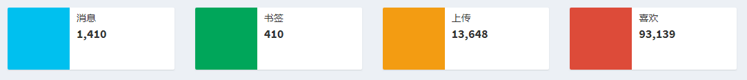
信息框 信息框用于显示统计代码段。有两种类型的信息框。
第一类信息框
infobox
标记
1 2 3 4 5 6 7 8 <div class ="info-box" > <span class ="info-box-icon bg-red" > <i class ="fa fa-star-o" > </i > </span > <div class ="info-box-content" > <span class ="info-box-text" > Likes</span > <span class ="info-box-number" > 93,139</span > </div > </div >
第二类信息框
1 2 3 4 5 6 7 8 9 10 11 12 13 14 15 <div class ="info-box bg-red" > <span class ="info-box-icon" > <i class ="fa fa-comments-o" > </i > </span > <div class ="info-box-content" > <span class ="info-box-text" > Likes</span > <span class ="info-box-number" > 41,410</span > <div class ="progress" > <div class ="progress-bar" style ="width: 70%" > </div > </div > <span class ="progress-description" > 70% Increase in 30 Days </span > </div > </div >
您需要更改为在这些样式之间切换的唯一方法是更改bg- 类的位置。对于第一个样式,将任何bg- 类应用于图标本身。对于其他样式,将bg- *类应用于info-box div。
框 框组件是整个模板中使用最广泛的组件。您可以将它用于从显示图表到文本块的任何内容。它有许多不同的风格,我们将在下面探讨。
默认Box标记 1 2 3 4 5 6 7 8 9 10 11 12 13 14 15 16 <div class =“box” > <div class =“box-header with-border ”> <h3 class =“box-title” > 默认框示例</ h3 > <div class =“box-tools pull-right ”> <! - 按钮,标签和许多其他东西都可以放在这里! - > <! - 这是一个标签,例如 - > <span class =“label label-primary ”> 标签</ span > </ div > <! - /.box-tools - > </ div > <! - /.box-header - > <div class =“box-body” > 盒子的主体 </ div > <! - /.box-body - > <div class =“box-footer” > 盒子的页脚 </ div > <! - box-footer - > </ div > <! - / .box - >
1 2 3 4 5 6 <div class =“box box-default ”> ... </ div > <div class =“box box-primary ”> ... </ div > <div class =“box box-info ”> ... </ div > <div class =“box box-warning ”> ... </ div > <div class =“box box-success ”> ... </ div > <div class =“box box-danger ”> ... </ div >
实心盒子 Solid Boxes是展示盒子的另一种方式。只需将box-solid类添加到box组件即可创建它们。您也可以将固定框与上下文类一起使用。
1 2 3 4 5 6 <div class =“box box-solid box-default ”> ... </ div > <div class =“box box-solid box-primary ”> ... </ div > <div class =“box box-solid box-info ”> ... </ div > <div class =“box box-solid box-warning ”> ... </ div > <div class =“box box-solid box-success ”> ... </ div > <div class =“box box-solid box-danger ”> ... </ div >
盒子工具 框可以包含用于部署特定事件或提供简单信息的工具。以下示例在框的标题中使用了多个AdminLTE组件。
AdminLTE data-widget属性提供了可以折叠或删除的框。按钮放置在盒子工具中,盒子工具放置在盒子标题中。
1 2 3 4 <! - 这将导致单击时删除框 - > <button class =“btn btn-box-tool ”data-widget =“remove”data-toggle =“tooltip”title =“Remove” > <i class =“fa fa-times ”> </ i > </ button > <! - 这将导致单击框时折叠 - > <button class =“btn btn-box-tool ”data-widget =“collapse”data-toggle =“tooltip”title =“Collapse” > <i class =“fa fa-minus ”> </ i > </ button >
如果在app.js加载后在文档中插入了一个框,则必须通过调用.activateBox()以下方法显式激活折叠/删除按钮:
1
2
3
<script> $("#box-widget" ).activateBox(); </script>
Loading States 要模拟加载状态,只需将此代码放在.box结束标记之前。
1 2 3 <div class ="overlay" > <i class ="fa fa-refresh fa-spin" > </i > </div >